- Role
- Team lead · UI/UX design, user interviews
- Team
- 5 people
- UX methods
- Competitive analysis, user interviews, persona, storyboards, sketches, wireframes, prototyping, usability testing
- Tools
- Figma
What I did
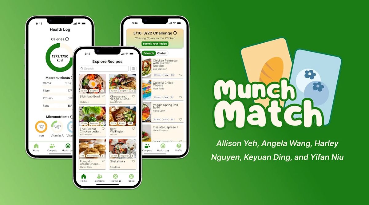
A healthy eating app that helps college students track nutrition and find recipes that fit their goals, grounded in interviews with students on campus.
- Led a 5-person team designing a nutrition-tracking app for college students, grounded directly in campus user research interviews.
- Led user interviews with 13 beginner cooks and synthesized the findings into five design insights that shaped the persona, storyboards, and feature priorities.
- Drove the UX design from low-fidelity sketches and mid-fidelity wireframes to a high-fidelity Figma prototype, revising it through peer critique and usability evaluations.
- Delivered a high-fidelity app and companion website showcasing key features and the design process through interactive, clickable Figma prototypes.
Design process
Read the case study ↗How might we help busy young adults who are new to cooking build healthy, lasting eating habits, given their limited time, budget, and kitchen resources?
- Research
Compared five existing healthy eating apps, and I led interviews with 13 beginner cooks aged 19 to 24. Five needs stood out: too little time, tight grocery budgets, apps that make cooking and nutrition tracking feel complicated, limited cooking skills, and cooking that feels like a chore.
- Persona and storyboards
Turned the interview findings into a persona of a busy student who relies on takeout, and two storyboards: cooking challenges shared with friends, and quick, low-cost recipes for a tight schedule.
- Sketches and wireframes
Explored recipe browsing, step-by-step recipe pages with video, a nutrition log, and weekly challenges in low-fidelity sketches, then refined the home, recipe, and nutrition analysis screens as mid-fidelity wireframes.
- High-fidelity prototype
Built the full interface in Figma as a clickable prototype.
- Usability testing
Revised the design after peer critique and mini-evaluations: larger body text, a single-column filter page with collapsible categories, higher-contrast buttons and navigation, a clearer servings control, a more consistent color palette, and a simpler main flow without the separate friends page.